We’ve been around for almost a decade, and we hadn’t taken a close look at our brand since the first iteration of the company. Depending on who you ask, we either felt we didn’t need to or we desperately did. We’ve been pretty successful over the years and the work we do for clients continues to go from strength to strength.
In fact, it’s our client work that has caused us to outgrow the former iteration of our brand. The work we do today is more comprehensive, more challenging, and it’s for bigger brands. And we realised we needed to overhaul how we look and how we express ourselves to fit with the type of company we are today. But there’s something else at play here too. We’re marketing experts. And we love nothing more than digging into a new client and really discovering who they are and what they need and the best way of getting it for them. And it was about time we gave that sort of focus to the place that brings us all together and that we’re so proud of.
We tailor every proposal to the needs of the client’s brief. This tailoring has meant we’ve naturally refined how we look and sound. We’ve also evolved how we devise and execute our internal marketing year on year. But without decent guidelines, the brand is open to interpretation and, honestly, has been diluted over the years.
But our experts haven’t had the chance to get their mitts on the Fifty Five and Five brand in its entirety.
The evolution of us
As mentioned, our growth has meant the type of work we do has changed. The number of people who do that work has expanded. In fact, when we really get down to it, we’ve changed a lot since our fledgling first years. Save for the founder and a couple of diehard employees who’re part of the furniture, we’re a completely new cohort of people than when the first version of the company was devised.

Getting high on our own supply
What was our first step? Well, we treated ourselves like we would any of our clients. And that meant working hard to understand:
- What our current brand represented
- Did our current brand fit with who we are now?
- What brands do we feel most connected to?
- What makes us unique?
- Did the current brand match our ambitions?
We’re a great marketing agency (if we do say so) and the work we do for our clients delivers excellence. We’re excellent at building long-lasting relationships with our clients thanks to the time and effort we put in to really understand them. So, we wanted to instil that belief into the fibres of our brand.
One of the aspects that makes us a great place to work (and work with) is our melting pot of experts with different backgrounds and perspectives. It was important that we brought in the thoughts, opinions and perceptions of everyone who works here.
A survey for your thoughts?
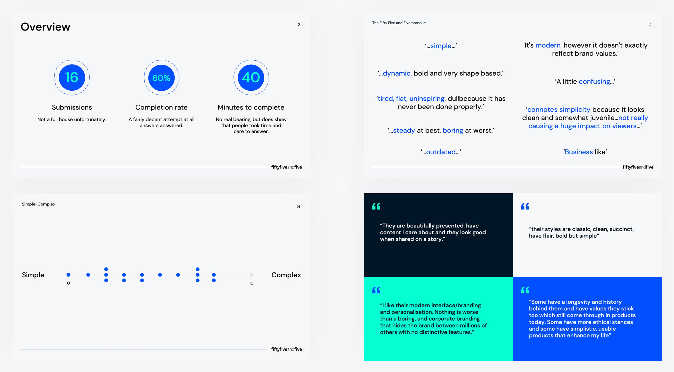
We wanted to take a critical look at our brand, and who better to ask than the people, the voices that make up our very existence as a company? The goal here was to find insights from as much data as possible. So, understanding how our people viewed us was a great starting point.
Our rebrand needed to be based on two specific elements:
- The Big Growth Plan
- The People
Our questionnaire focused on what did or didn't make our people connect with the current brand. We wanted to find out what personal connections they have with other brands both in the world of B2B technology and the wider world outside our industry. This was important for our redesign, but also helped us understand our colleagues better and make sure that the new brand clicked with the group.

The idea was to gather people’s honest and unchallenged thoughts through a set of designed questions and begin to pull quotes and patterns from the answers. From there we could pick stand-out information and begin to create foundational statements and form a framework that could eventually be brought to life.“The brand needs to be…”
Our framework provided us with the foundation for building our brand as well as being a guide to consistently come back to make sure we were staying on track.
Colours and competitors
An important part of any brand or company examination is to understand what your competitors are doing. From the data we had begun to collect we were able to conduct several exercises drawing certain insights around:
- Competitor research – looking at our competitors from a variety of touchpoints, including tone of voice, visual style and brand values
- Current brand positioning – comparing our current brand to our competitors, finding where we sit and where we want to be
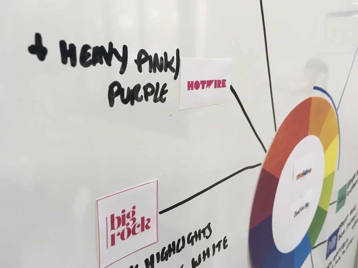
- Colour wheel – the potential visual areas to exploit to make us stand out from the crowd
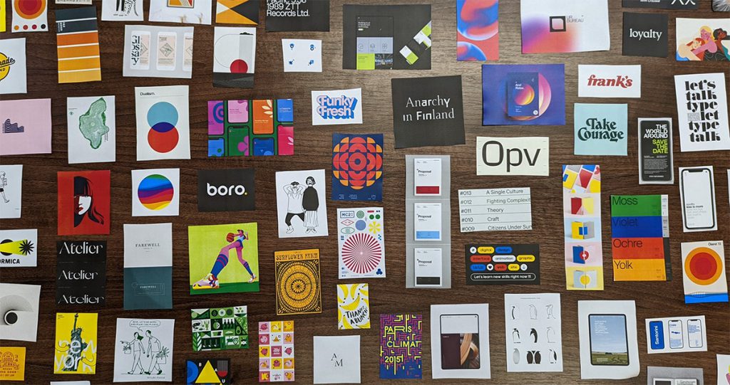
- Visual inspiration – using our framework, plotting visual styles on an axis to find elements that fit with our needs
From here we developed the beginnings of a colour wheel and the first steps towards visual inspiration. Which then laid the foundation for our tentative first routes of the new brand. Things were getting exciting.

Half the battle is in your head
There’s the balance of pushing your preconceptions to the side (especially as our designers and other teams work here and know the place as a very specific thing) and concentrating on hitting the brief. You have to have the ability to detach and be cold in your judgements while letting your imagination off the leash. To be able to step away from the company you work for and put yourself in the customers’ or prospects’ shoes.
That’s what we’ve done, and we’re excited to see what you think.
Read the next blog in the series
In the next blog in this series we look at how we agreed a single direction top develop.

