Company Information
The Microsoft Surface team is a division within Microsoft responsible for the development and production of the Surface line - a range of premium personal and professional devices.
Challenge
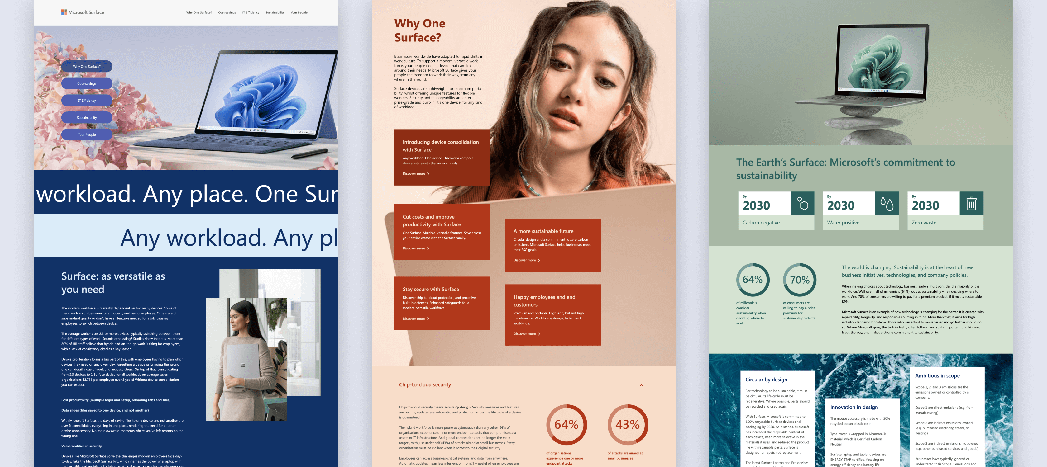
Modern work comes in all shapes and sizes. So do Microsoft Surface devices, which are ideal for modern, flexible working, and on-the-go go-getting. A device with a difference – this project required “more than just a microsite.”
Microsoft wanted a hero asset that married together tradition and modernity, just like the Surface device itself, and which drove up engagement for prospective buyers. The microsite would be a subsidiary piece for the Surface device web page, and a lead generation tool.
One of the main priorities for Microsoft was to drive user engagement to their costs page and business cases.

Solution
As experts in crafting B2B solutions for engaging content, we wanted to flex our creativity.
Along with Microsoft, we decided on an interactive microsite – not quite a web page, not quite an eBook. Something in-between, which pushed the boundaries of content creation at Fifty Five and Five and interactive content for B2B.
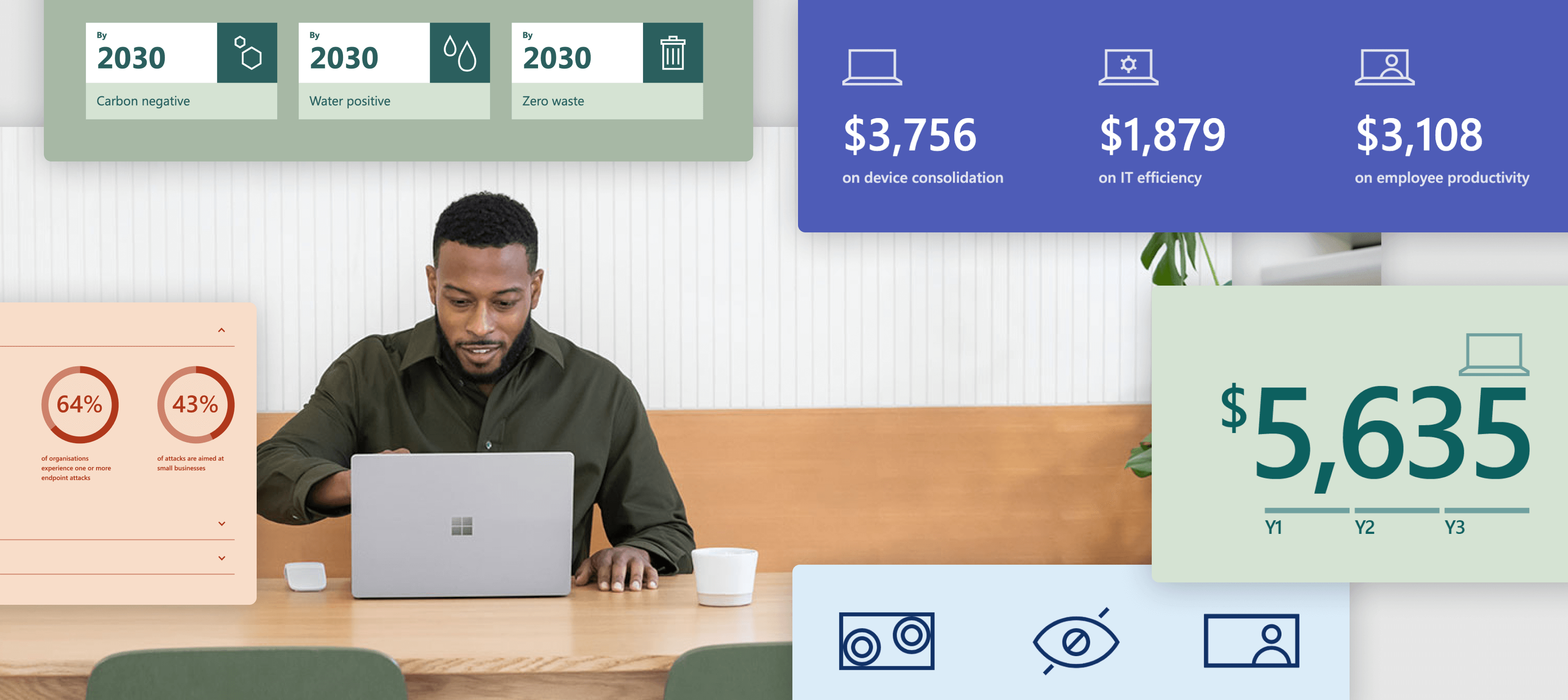
We approached this interactive content asset differently, assigning more collaboration time between content writers and designers. Our writers picked out copy that was ideal for visual representation, crafting an experience that was engaging and immersive. Our design team worked to create something bespoke that perfectly complemented the devices themselves, incorporating interactive breakouts and eye-popping imagery.

Outcome
The end-result is unique, just like the devices themselves. The microsite is informative, and provides prospective leads with in-depth content, but also has playful elements, which has kept engagement rate high.
Currently, the interactive content is being used as both a sales tool – with a wealth of information to support the sales lifecycle – and a showcase piece for new leads. It has been well received by Microsoft, and its partners, generating a significant amount of engagement in three months.
The microsite has a very high session duration of just under 9 minutes (industry average is 2-3 minutes) - a testament to both the content and user experience.
The “Cost” section of the site is a top performer on the page. This is great as cost and the business case for Surface was a priority. We drew users to this section with a structured user journey, interactive elements, and high-contrast colour emphasis. The microsite proves that interactive content for B2B can deliver exceptional results and engage with users.
Over 8 mins
average session duration.
60% of users
returned to the interactive web page.
4X greater
leads generated compared to their traditional e-book.
This site really raised the bar in terms of the quality of content we have taken to Partners. The copy is beautifully written, and the interactive elements are keeping prospective buyers engaged.